


Branding Guidelines: The Secret Recipes of Spotify, Uber and Yelp
Last update: 26 November 2021 at 02:56 pm
 5.00/5
Branding guidelines are the visual identity communicated by a brand. Logos, colors, typography, images and iconography, website, packaging, etc. A meticulous work that can take time but is essential.
In this article, we take several examples to help you design your branding guidelines. We can also put you in touch with the best branding agencies.
Why Create Branding Guidelines?
The identity of a brand corresponds to the way it wishes to be perceived by its customers. The objective is to align the perception that customers have of a brand with the identity that this brand wants to create.
To achieve this, a well-established and well-communicated personality is essential. From your logo to the font used, the visual tells customers who you are and differentiates you from the competition.
What Are the Benefits?
Branding guidelines are a valuable document. Here are its advantages:
- The clear and precise implementation of your brand’s visual language.
- The control of a unique “voice” on several supports. The brand remains identifiable in all its visual variations and on all media. Both physical (business cards, flyers, packaging, letterhead, merchandising …) and digital (website, social networks, videos, newsletters …).
- A faster implementation of new forms of communication, thanks to the visual declensions envisaged.
- The work done to build it allows you to better determine the DNA of your brand and to make it stronger. This is valid both internally and externally.
- Consistency preserved despite changes in your team.
- Fewer solicitations from staff or partners for each graphic decision.
Consulting: make sure you design the perfect visual identity with the help of the best agencies 🔥
We can put you in touch with graphic design agencies all over the world. From Sydney to Dubai or even Hong-Kong, Sortlist is here for you!
What are in Branding Guidelines?
The branding guidelines are the bible of your visual communication. It contains everything that concerns it, adapted to your product or service. Let’s see several examples.
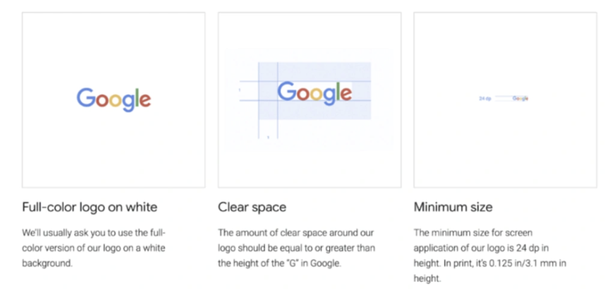
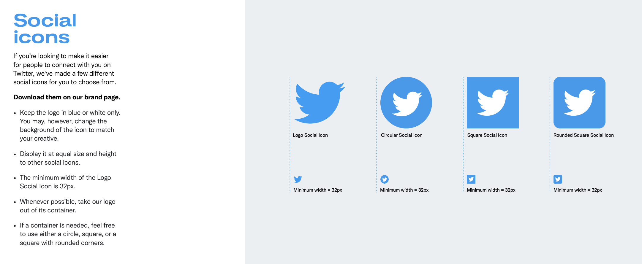
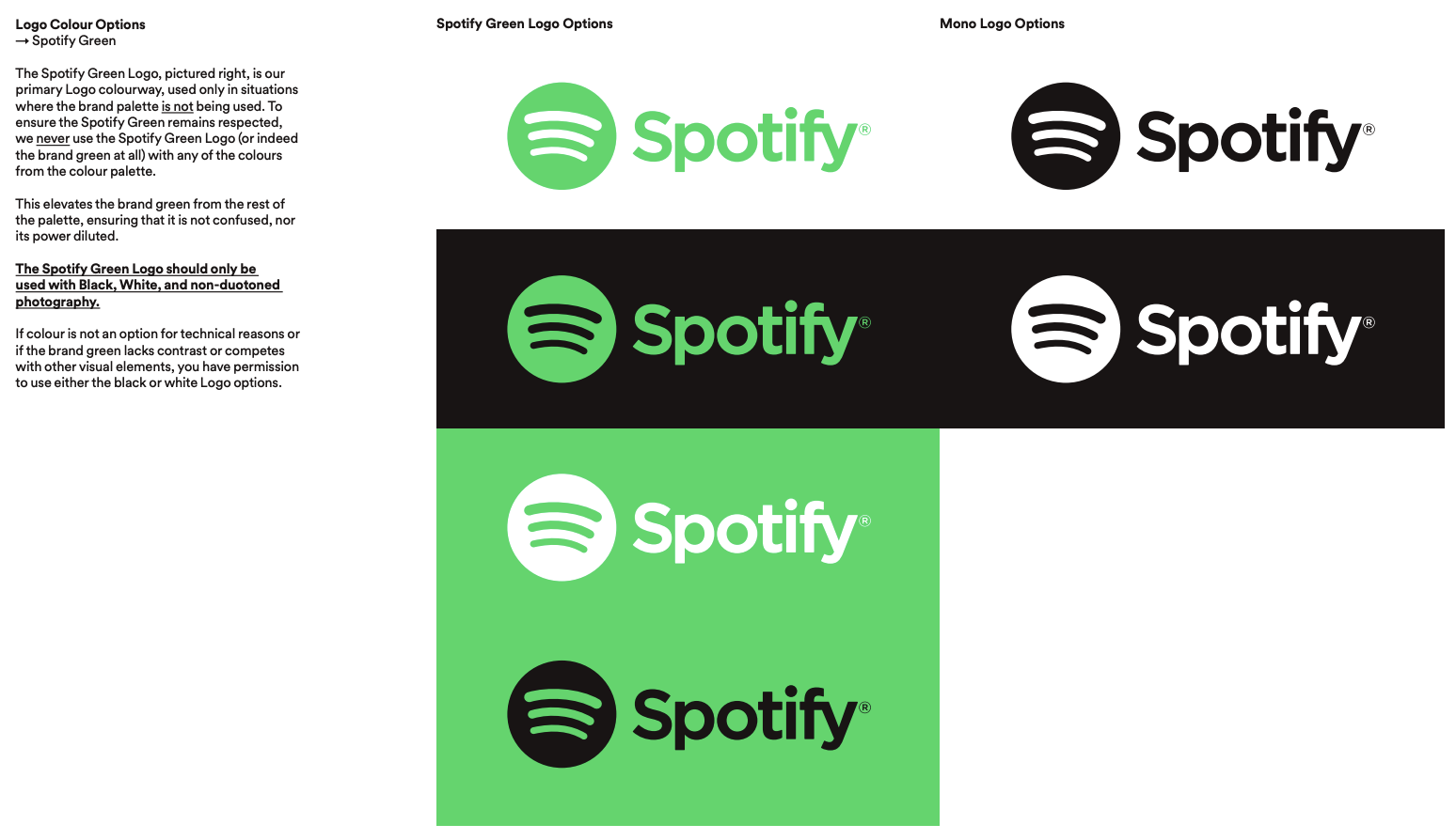
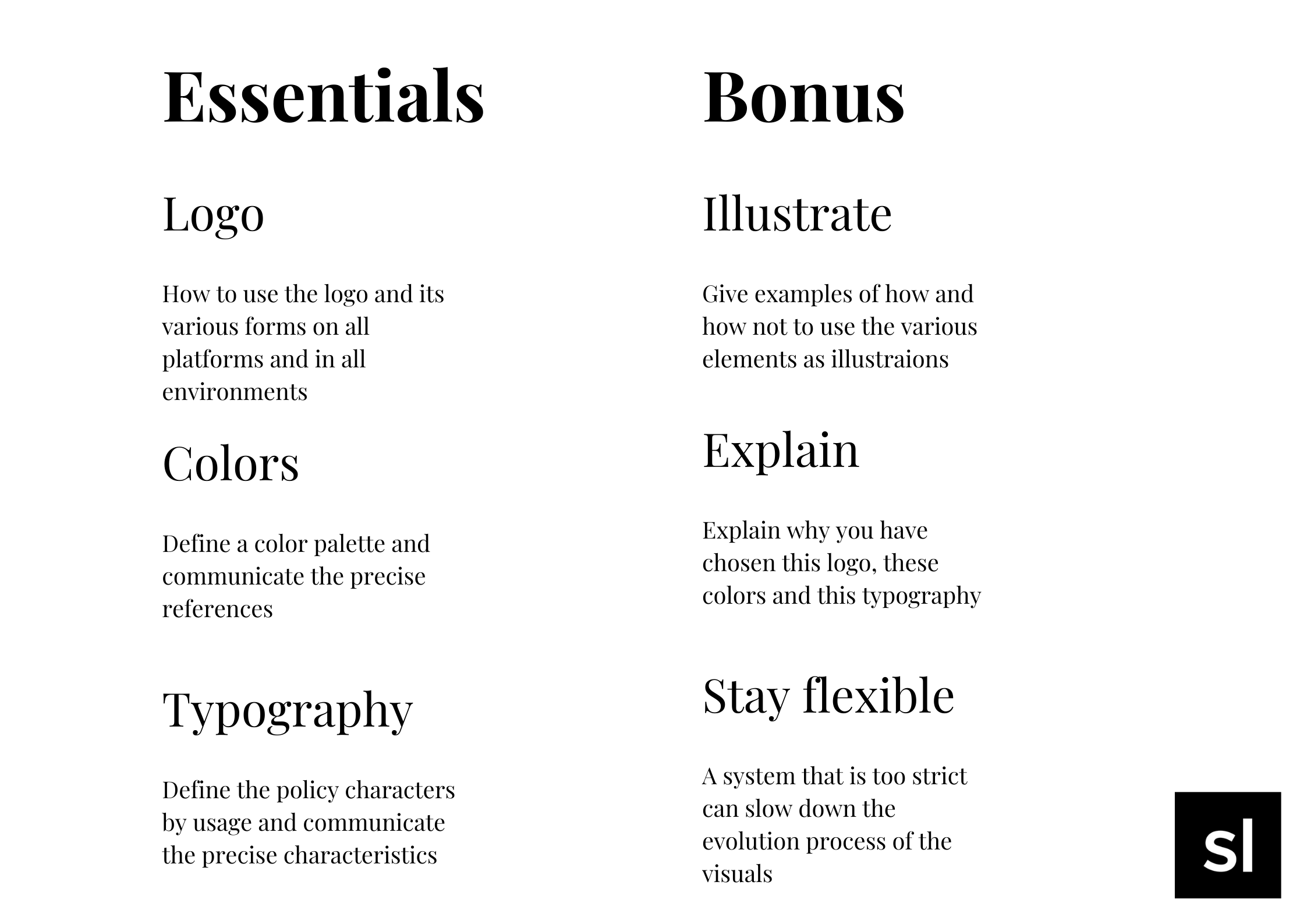
The Logo and Its Variations: Precision Like Spotify
The logo is the central element of your image. It is therefore important to specify how it should be used, depending on the medium and the environment, to avoid distortions or inappropriate uses.
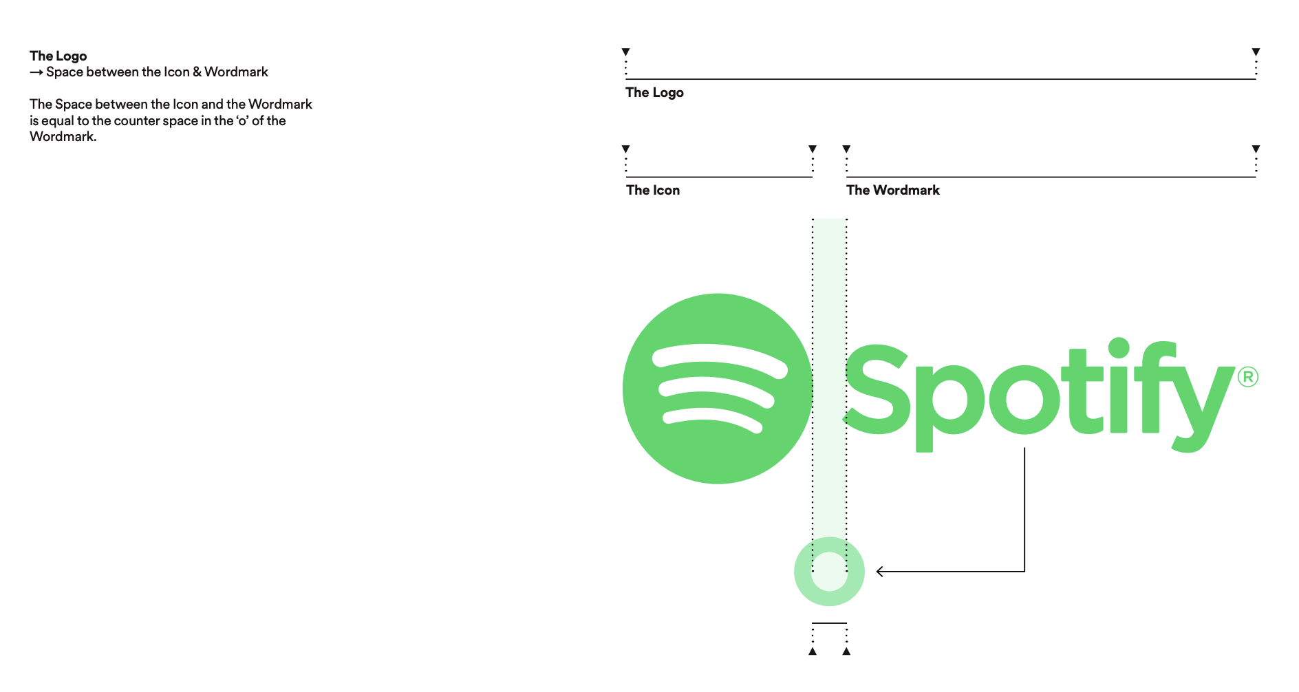
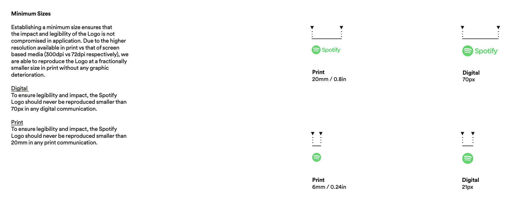
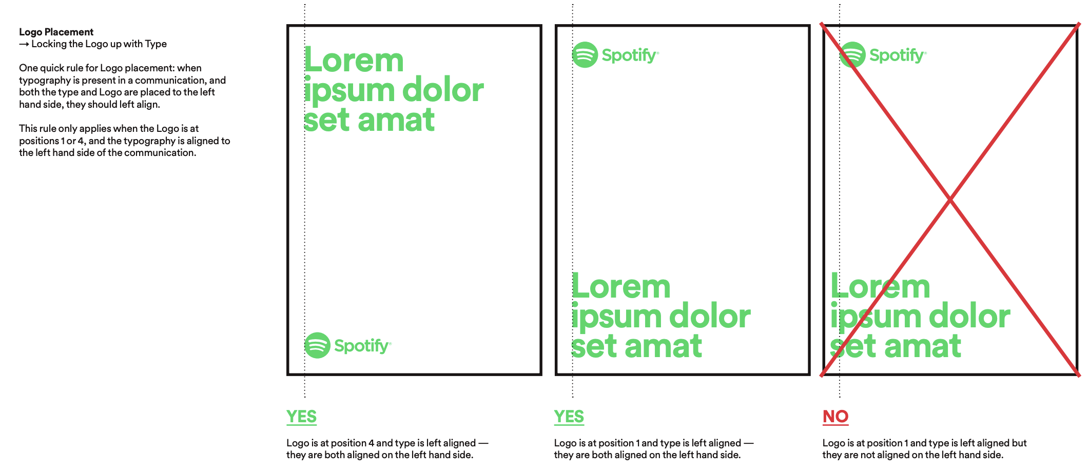
Here are the different elements to keep in mind:
- The dimensions according to the use (digital or print, social networks or stationery, buttons or quotes…) and minimum sizes.
- Which logo variation for which use, with wordmark or not.
- The logo colors allowed according to the context or backgrounds (white, colored, transparent, dark…).
- The safety margins, protection zones and spaces to be preserved.
- Desired alignment and positioning with other elements on the page.
With a straightforward and concise guide, Spotify covers the essentials of its branding guidelines, focusing on logos and colors. This includes the use of its famous green in different contexts, but also the placement of the logo in multiple scenarios. The third part is dedicated to the messages to communicate in case of partnership.
Another example is WhatsApp, which devotes a full page to the spelling of its name in its branding guidelines.
Colors: Didactic Like Cisco
The color palette creates an emotion. We always associate a color with a feeling. It is therefore important to choose them carefully, depending on the product and the sector of activity of your brand. However, it is advisable to limit yourself to 4 or 5 colors to help with memorization.
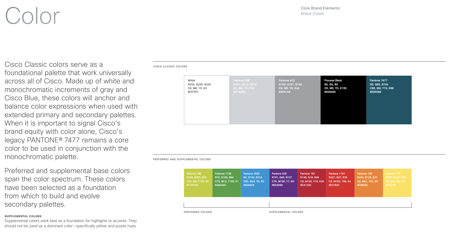

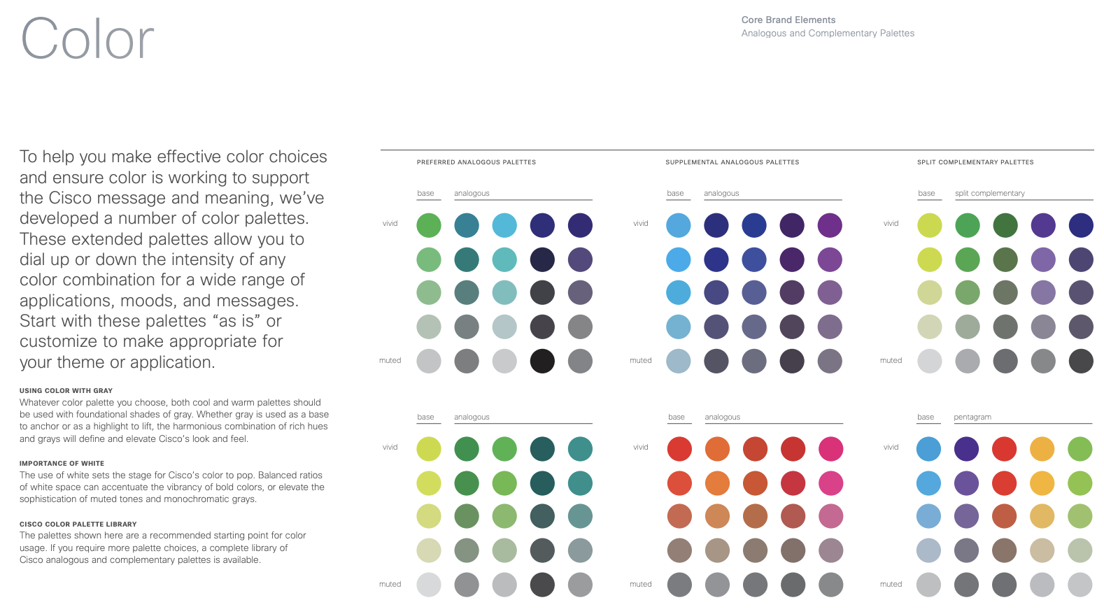
Here are the different elements to take into account when choosing your colors:
- Select a main color and complementary colors.
- Take note of the color codes for printing: CMYK.
- The same goes for digital color codes: RGB and HEX.
- Define which color should be used in which situation, including the background (colored, white, dark).
Typography: As Integral as Foursquare
Typography is one of the essential components of a company’s graphic universe. Like colors, it can be associated with a feeling. It is therefore necessary to choose it with care and associate it with a complementary font, while specifying its contexts of use.
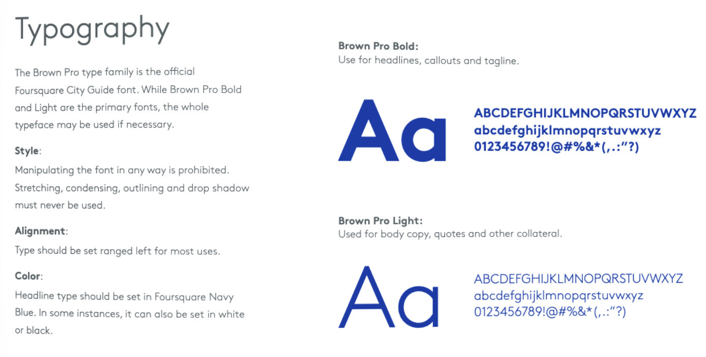
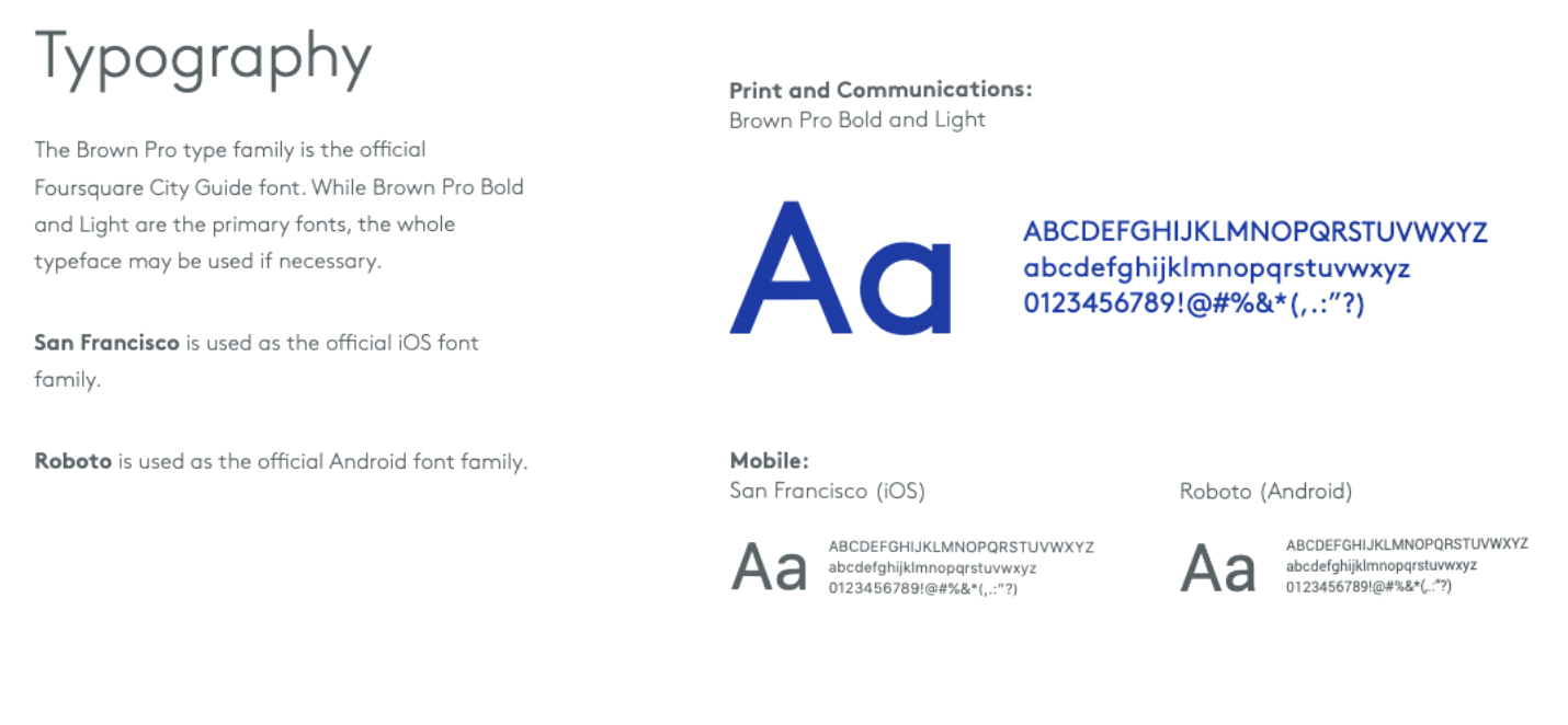
Here are the different elements to define:
- The typography of the wordmark logo, headlines and content.
- Their complete references with colors, alignment and spacing.
- All necessary instructions for the format of the editorial content (text, quote, form, menu…)
- The variations envisaged according to the support of reading (type of mobile, paper or web…)
With a 50-page charter, Foursquare details the lines to follow to preserve its image in detail. The typographic part is particularly well done, with complete characteristics, examples, uses according to the content and the support, and specificities to follow for iOS and Android.
Some Important Details: Handy Like Yelp
- Add illustrated examples of good and bad uses.
- Specify how to proceed for cases specific to your needs.
- Aim for the big picture: from packaging to a website, consistency is key.
- Provide simplified versions of logos.
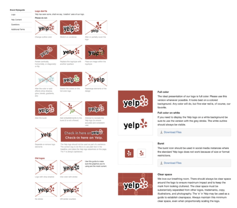
Yelp has put together a real guide. Richly illustrated and commented, the examples show how to proceed. It is also possible to download all the necessary material to respect the branding guidelines. And that’s only for the “Brand” section, which is alongside the “Color”, “Icons”, “Mobile” and “Web” sections, with lines of code provided directly to developers.
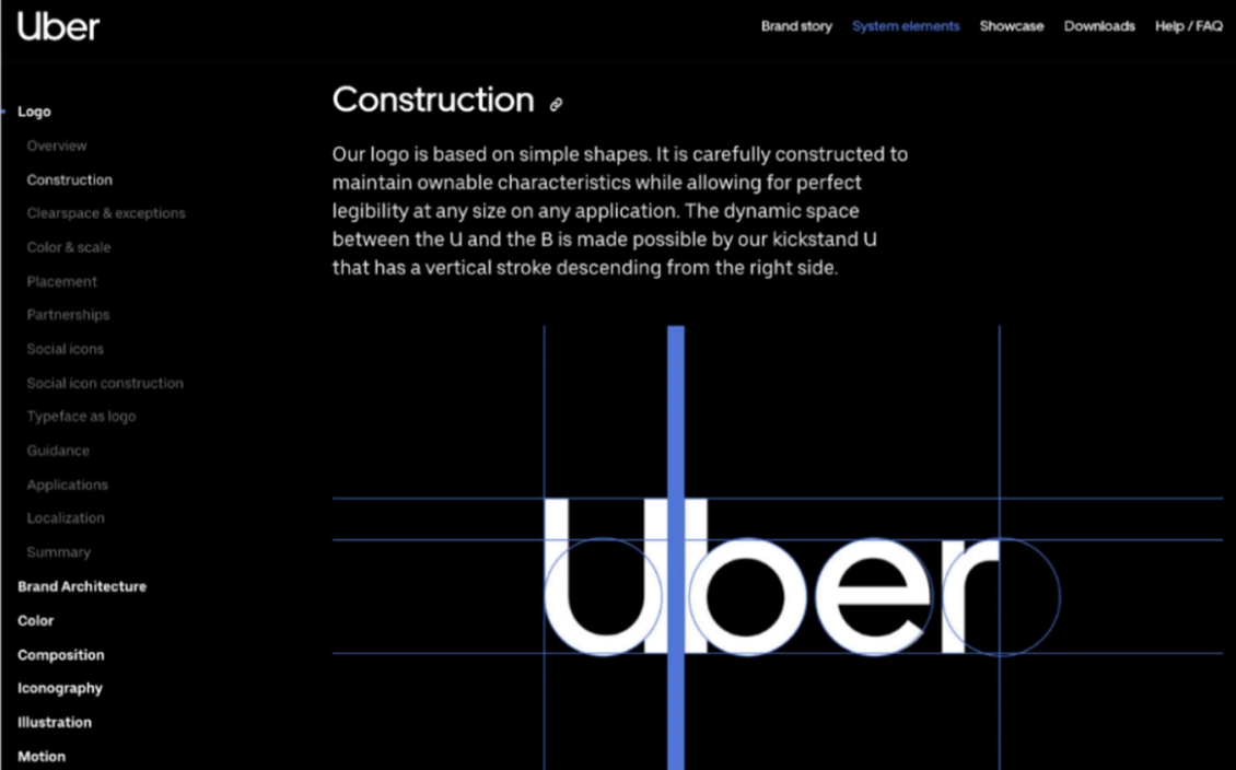
The Little Extras That Change Everything: Mastered Like Uber
- Be precise and complete but flexible enough. On the one hand, so as not to block designers who might find themselves blocked by too much rigidity. On the other hand, to allow your branding guidelines to evolve with the brand.
- Explain your choices. Add to the charter a few “brand platform” type pages that explain the mission, the target audience, the values and the vision of your brand. This will make it easier to follow.
- If you use photos, explain what kind of shots are allowed or not, in what format (landscape, square, portrait), the dimensions, and possibly the retouching or filters to be added to ensure greater consistency.
- If you are producing content, you can add the desired editorial tone and vocabulary.
Uber’s impressive guidelines can be found online. They don’t leave anything to chance. Everything is explained, completed and summarized. Typography, logo, photos, and even the tone of the content, it’s a little lesson to go and consult as soon as possible.
In Summary, Branding Guidelines Should Include
Where to Start?
The design of branding guidelines must be part of a more global strategy. What is your objective and how do you want to achieve it. Mission, values, target audience, personality, vision, specificities. It is all this upstream work that will decide the visual strength of your brand. Weaker identities can’t give birth to a strong visual.
Watch the TEDx conference “Why a brand DNA is so important in a brand strategy”:
What You Can Do Now
To visually define your brand, you must first define it as such. We can help you in this work by putting you in touch with the best agencies.
If you haven’t yet taken the time to do so, find out externally and internally how your stakeholders perceive your brand. By creating personas, target the audience you want to reach, to understand their values and needs.
You should have a lot of textual information, often linked to emotions. The challenge will be to transform them into a strong identity and then into a visual identity. Use what you already have.
You can also analyze the competition to know what makes the difference. Take inspiration from the best and surround yourself with professionals to establish your charter.
By the way, Airbnb and WhatsApp’s work on their identity and their translation into visuals is remarkable. You can check them out here and here.


