


The Ultimate Guide to Web Design
Last update: 12 August 2024 at 08:21 am
 5.00/5
Today, almost every business needs a web page. Even small businesses just starting out. It’s the perfect way to stay ahead of the game and attract new customers. But it can’t just be a random page with some pictures and a few words. You need a web design that converts visitors into customers.
Our “Ultimate Guide to Web Design” serves as an introduction to the do’s and don’ts of this ever-evolving field. It will guide you through the various elements you need to carefully consider, such as: typography, colors, goals, layout, navigation, responsiveness, SEO, and more.
Let’s get started!
Introduction to Web Design
The name itself is very explanatory, web design refers to the process of designing websites. But when you analyze what it actually means, you realize that it’s a very deep concept.
Web design revolves around the process of planning and arranging content on a website so that anyone, anywhere in the world can access it. This, of course, includes aesthetics, functionality, and usability.
As if that were not enough, we need to carefully remind you that the process of designing a website is never completely finished. It is a dynamic field that is constantly evolving. Your job is to make sure that your site keeps up with the trends and meets the needs of your users.

Interestingly enough, this process is led by a web designer. But he needs a team of different professionals to be able to produce a website that’s beautiful and functional. For example, he needs help from graphic designers, SEO specialists, UX specialists, content creators, and more.
Importance of effective web design in user experience (UX) and conversion rates
Web design plays a key role in the success of your website. It is responsible for providing intuitive navigation, attractive visuals, positive interactions and, of course, converting visitors into customers or subscribers.
With that in mind, it’s imperative that your site provides an exceptional user experience. One that’s packed with usability and efficiency. One that drives engagement and conversions, and reduces barriers and friction. And one that makes it easy for users to find information and take action.
If you can create a site like the one we’ve described, you’ll increase your chances of satisfying their needs and creating a positive perception of your brand. You will also see better numbers in terms of time spent, returning users, conversions and subscriptions.
There is a direct correlation between the user experience you provide and your conversion numbers. If you want your visitors to take a certain action, you need to make it easy and clear for them to do so. You need to use the right colors, words, and elements to inspire trust and strengthen the relationship with each person who lands on your site.
Evolution of web design trends
The very first website was launched in 1991. Since then, web design has changed in many ways. Of course, a large part of those changes have happened thanks to technology and its direct impact.

Let’s take a quick look back at how it all started and where we are today. Back in the 90’s web design was dominated by bright colors, but almost no one had an interest in creating a web page for their business. This was only limited for some tech companies.
As we hit the early 2000’s, new tools like Flash arrived and made design much easier and more animated. But it was not until the 2010’s where we saw a major update. The release of Web 2.0 allowed users to share information with each other. Bubbly typography, glows, gradients and shadows were the norm.
As the years went by, we began to see minimalism, simplicity, and white space take over. Illustrative UIs, beautiful animations, and flat design too. But as we enter the era of AI, we are now experiencing a major shift in web design. One where we are now talking about generative designs, IoT designs, and XR designs.
Fundamentals of Web Design
It’s time to dive deep into the practice of web design. Let’s start by reviewing the basics that will help you create an attractive and useful website.
Understanding the principles of design
Authors tend to disagree on how many design principles there are, but we can all agree that there are at least 12.
The key is to understand that you need to be able to combine them in different ways to achieve great design. Don’t limit yourself to using 2 per design. Go further and try to mix and match at least half of them to create visually appealing and functional creations.
The 12 Principles of Design are
- Contrast: Difference between elements within a design to make them stand out.
- Balance: The way you arrange the elements of your design in relation to a line that may or may not be centered.
- Emphasis: what makes certain parts of your design stand out or not in relation to other elements.
- Proportion: The size of the elements of your design in relation to each other.
- Hierarchy: The importance of an element within your design.
- Repetition: repeating colors, images, lines, etc. to reinforce an idea.
- Rhythm: spacing between elements to create emotion in the viewer.
- Pattern: Repetition of design elements or the standard in which they are laid out.
- White Space: Areas of your design without elements that help other elements stand out,
- Motion: The way the viewer’s eye moves across the design. Your elements should lead them from one important element to the next.
- Variety: helps keep designs from feeling monotonous or boring. Can be achieved through different typographies, colors, images, etc.
- Unity: How well the elements of your design work together.
Keep in mind that you can create a good design even if you don’t know these principles. But paying close attention to them and what they stand for will make it much easier for you to create something that looks good and serves a purpose.
Typography best practices for web design
That said, it’s important to pay close attention to the typography you use throughout your web pages. It is responsible for allowing visitors to comfortably read the content you share, while reducing your bounce rate.

In other words, good typography should:
- Promote readability.
- Encourage visitors to spend more time browsing your site and consuming the information you share.
- Capture your visitors’ short attention spans.
- Make it easy for users to skim through your site.
- Adapt to any screen size and device type.
But how do you make all this happen on your site?
Typography Best Practices
- Stick to one or two fonts on your site, and make sure they are visually compatible.
- Make sure the body of the text is always sans serif, as this helps with readability and reduces distractions.
- Choose a standard font for the rest of your copy. This increases the chances that everyone can see it clearly from any digital device.
- Set your body text to at least 16px, and your headlines should always be larger.
- Avoid using all caps; it makes the user feel uncomfortable.
- Be careful with the colors of your text and background. You want to make sure it stands out and is easy to read.
- Your text should be a consistent color, except for hyperlinks, which need to stand out.
- Stick to 40-80 characters per line. Stuffing more words will make the user feel bored.
- Make sure there is enough white space so that users can rest their eyes. Ideally, your white space should be 50% of the height of each line of text.
- Don’t overdo it and animate your text… it will only hurt you!
- Finally, you want to test your text and look for any potential problems that might distract your visitor’s attention.
Color theory and its application in web design
Just like typography, color plays a key role in your web design. It is a powerful tool that helps you communicate a message, evoke emotion, create brand recognition, and even provide a pleasing experience for everyone who lands on your site.
Color theory states that each color has specific meanings and conveys certain emotions. As your web designer works through your site, you want to make sure they stick to those colors that help you better communicate your message.
For example, the color red promotes power, importance, and youth. While orange evokes friendliness, energy, and uniqueness. With yellow, you can convey youthfulness, vibrancy, energy, freshness and optimism. Blue is associated with calm, trust, competence, peace and logic. Green is associated with growth, stability, financial and environmental issues.

Black is a color that evokes power, elegance and sophistication. While white is mostly associated with cleanliness, virtue and simplicity.
To effectively choose the colors for your website, you must first take a step back and choose those that better align with your brand identity. Then you want to choose those that represent your principles and personality. Make sure they are consistent and create a color palette that serves as a guide for anyone who needs to work on your site.
Accessibility considerations in web design
Accessibility is the third factor to consider when launching a new website or redesigning your existing site. It is the one thing that will ensure that your visitors have a seamless experience regardless of their disabilities.
If you don’t, you risk losing potential leads and customers, and it makes you look like you don’t care about a large percentage of the world’s population who struggle with blindness, low vision, learning disabilities, hearing loss, or other disabilities.
That said, you need to make sure your site follows the four principles of web accessibility: perceivable, operable, understandable, and robust.
In other words, users should be able to perceive and understand your site’s content. Your content should be robust so that everyone can understand it, even with the help of assistive technology. And the navigation experience should be uninterrupted.
Planning Your Website Design
So far, you know how web design has evolved over time and the main theories and principles to keep in mind when designing your website. Now it’s time to go through the 4-step process of getting ready for your new website development.
Defining website goals and objectives
The first thing you need to do is think about what you want your website to accomplish in a given amount of time. The goal will vary from business to business. It’s imperative that you spend enough time thinking about this, as it will have a direct impact on how you design your site.
You want to set the goal of your website using the SMART approach. It needs to be specific, measurable, achievable, relevant and time-bound.
That said, you can set your goal to be:
- Increase brand awareness.
- Increase direct traffic.
- Improve ranking for specific keywords.
- Improve on-site user experience.
- Reduce your bounce rate.
- To increase subscribers.
- etc.
With that in mind… What will your website goal be? Remember, this is the starting point for every single action and element that follows.
Conducting audience research and creating user personas
As you move forward in the planning process for your website, you will want to dedicate time and resources to creating your user personas. These are fictional representations of your site’s ideal users, and in many cases can be the same as your buyer’s persona.
Your website persona must include relevant information such as: demographics (age, gender, location, title, etc.), user type (primary, secondary, tertiary, etc.), user needs (why are they coming to your website?), and business needs (what do you want them to do?).
Be sure to create your personas in the early stages of website design planning. This will have a direct impact on every decision you make, including colors, typography, content, pages, etc.
Working with a user persona in mind will help you make more informed decisions and align the web designers on your team behind a shared vision.
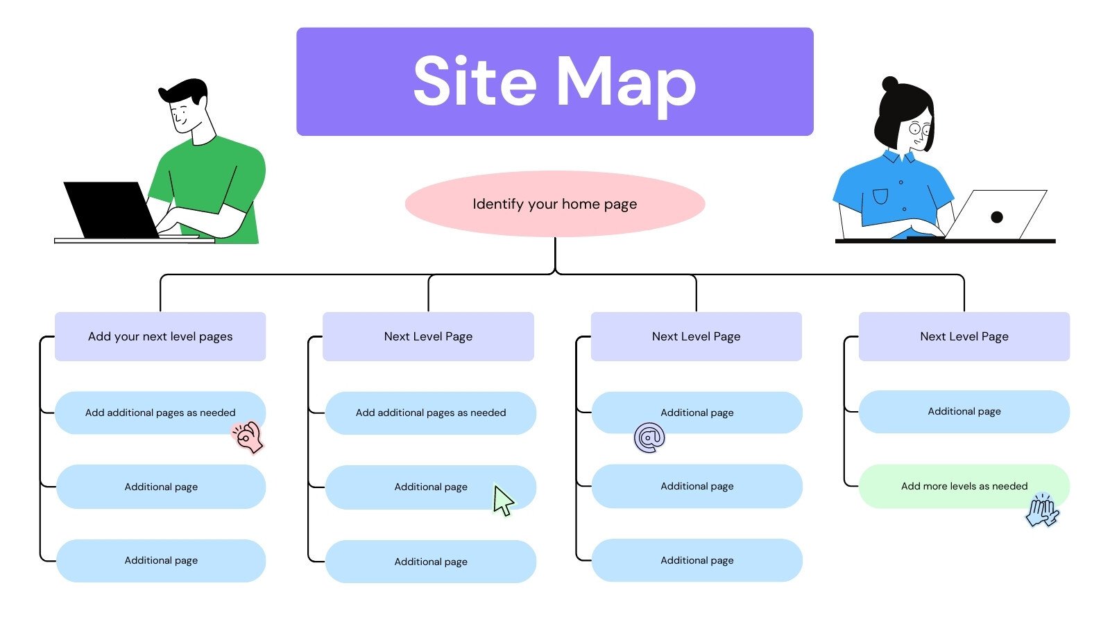
Information architecture and site mapping
With your site’s goals and user personas in mind, you need to carefully consider how you will organize and maintain your site’s content. The structure of the site, how it’s organized, and how it’s presented to the user.
Through this process, which is ongoing for management and maintenance, you need to build your sitemap. A document that states how the content is organized and that will come in very handy when your SEO efforts start.

Remember that your sitemap is a key part of the information architecture of your site.
Wireframing and prototyping techniques
Now that you have a big picture of what your site will look like, your team of website designers needs to sit down and build prototypes.
Today, you can work with different types of prototypes. You can use the quick sketches on white paper. Or you can use prototyping tools to create clickable mockups. Ideally, you want to build them for your website in HTML, CSS, or JavaScript, so that you are working with something that is as close as possible to your finished product.
This effort will come in handy because it’s the perfect way to test your designs with real users and present them to the board. It also serves as a bridge between your web designers and web developers.
The great thing about working with prototypes is that you can ask users for feedback and improve your site before it’s launched. Make your first version as good and functional as possible.
Elements of Effective Web Design
At Sortlist, we want to help you simplify the process of designing and building your new website. Pay close attention to the following 4 elements, each of which will have a positive impact on the functionality and usability of your site.
Layout design and grid systems
Consider using grids to organize and align the content on your web pages. They also help you achieve a more consistent, flexible, and responsive design.
This is especially true for almost any type of website, including e-commerce, commercial, blogs, news, and portfolios.
In a nutshell, working with a grid means relying on a structure of columns and rows to arrange elements on your site in a consistent pattern. Not only does this make life easier for the designer, but it also makes the experience more pleasant for the user, who does not have to struggle to figure out the structure of your page or where to find content.
There are several types of grids for you to choose from. These include column grids, hierarchical grids, manuscript grids, and baseline grids. Each one serves a different purpose, so be sure to choose one that fits the needs of your site and end users.
Don’t forget to choose a grid that is responsive and automatically adjusts to different screen sizes and device types.
Navigation design and usability
Navigation design is one of the most important aspects of user interface design. It is responsible for guiding users as they move through your website.
Spending time and budget on this step will allow you to launch a site with improved usability, a better user experience, and of course, a higher retention rate.
If that’s not what you’re looking for… what is?
Keep in mind that navigation design needs to be done essentially at the same time as your wireframing and prototyping efforts. They will all determine what your site architecture looks like.
To create an effective navigation design, it’s important that you, your website development team, keep the following tips in mind:
- Always work with the end user in mind. You want to build a site that encourages them to take action.
- Develop a clear information architecture that provides a logical structure for your content and features.
- Menus, breadcrumbs, search bars, every navigation element should be intuitive.
- Run usability tests and fix any problems you find.
Visual hierarchy and attention cues
Another key element of effective web design is visual hierarchy and attention cues. These terms refer to the way you arrange elements on your site to influence the user’s perception and guide them toward the desired actions.
Visual hierarchy basically states that you need to use certain attention cues to help the visitor understand which elements are more relevant than others. Typography, size, color, contrast, alignment, repetition, proximity, white space, texture, and style help you achieve this goal.
For example, making one element larger than the rest will make it more noticeable to the visitor. The same is true if you make one element lighter than the rest.
The way you use these attention cues will have a direct impact on the way the user interacts with you.
Multimedia integration
As you move forward with your site design, you may want to consider integrating various multimedia elements. Images, audio, animation, video, they all help make your site more interactive and visually appealing.
But before you overcrowd your site, make sure you follow some best practices in this process:
- Every image you add needs to be optimized for the web. This will help ensure that your site loads quickly and that the user experience does not suffer.
- Make sure your design is responsive and that each element you add can automatically adjust to different screen sizes and devices.
- Ensure that all your multimedia elements are accessible to all users, including those with disabilities.
Today, there are many different types of multimedia elements you can work with. It’s your job to understand which ones resonate better with your audience and how to maximize their power.
Responsive Web Design and Mobile Optimization
We live in a world dominated by mobile devices, and every day more and more people choose to surf the web from their smartphones or tablets. As a result, as a business owner, you need to make sure that your site delivers a great mobile experience. That every word is readable, every call to action is clickable, and every image is responsive.
Ignoring this trend will force your potential customers to look elsewhere for information and solutions.
So how do you make your site and visual elements responsive?
Techniques for creating a responsive website
When you first sit down to start designing your site, you need to do it with the idea that it will be seen on a mobile device (mobile-first design approach). Meaning you start designing for a much smaller screen and grow from there to a laptop or desktop or even a bigger screen. This forces you to use elements that work in these types of devices and screen sizes.
That said, there are several techniques you can use to ensure your site is responsive. We will list some of them here so you can better understand your options and do some research.
- Use responsive breakpoints or CSS breakpoints for the most common device resolutions. This will help ensure that your site’s content adapts to the screen size and resolution.
- Base your web design on afluid grid that positions and sets each element on your site in proportion to the screen on which it’s being viewed.
- Never forget about touchscreens, which are becoming increasingly popular these days. Your navigation elements, such as menus and dropdowns, should be large enough for anyone to touch with their fingertips.
- Use modern image and video tag attributes to make them responsive to different devices and screens.
- Make sure your typography is responsive, too, so it can quickly adjust to smaller screens.
Most importantly, test your site’s responsiveness in a variety of screen sizes and resolutions. You want to make sure that everything works and that your visitors have the best experience possible.
User Experience (UX) Design
Much of web design revolves around the user experience, so much so that there are web designers who specialize in UX. They are dedicated to making sure that the experience is as smooth as possible and that everything works.
But for all of this to work, the UX designer must invest time to learn how the users of your site act and feel. Understanding their behavior, how they perceive and react to things, is the key to ensuring a great user experience.
For example, if you identify design patterns that are familiar to your end users, you may want to replicate them on your site. They will help minimize the effort required to process information.
Also, the color wheel and the emotions each one evokes will come in handy when working on the UX aspect of your newly created site.
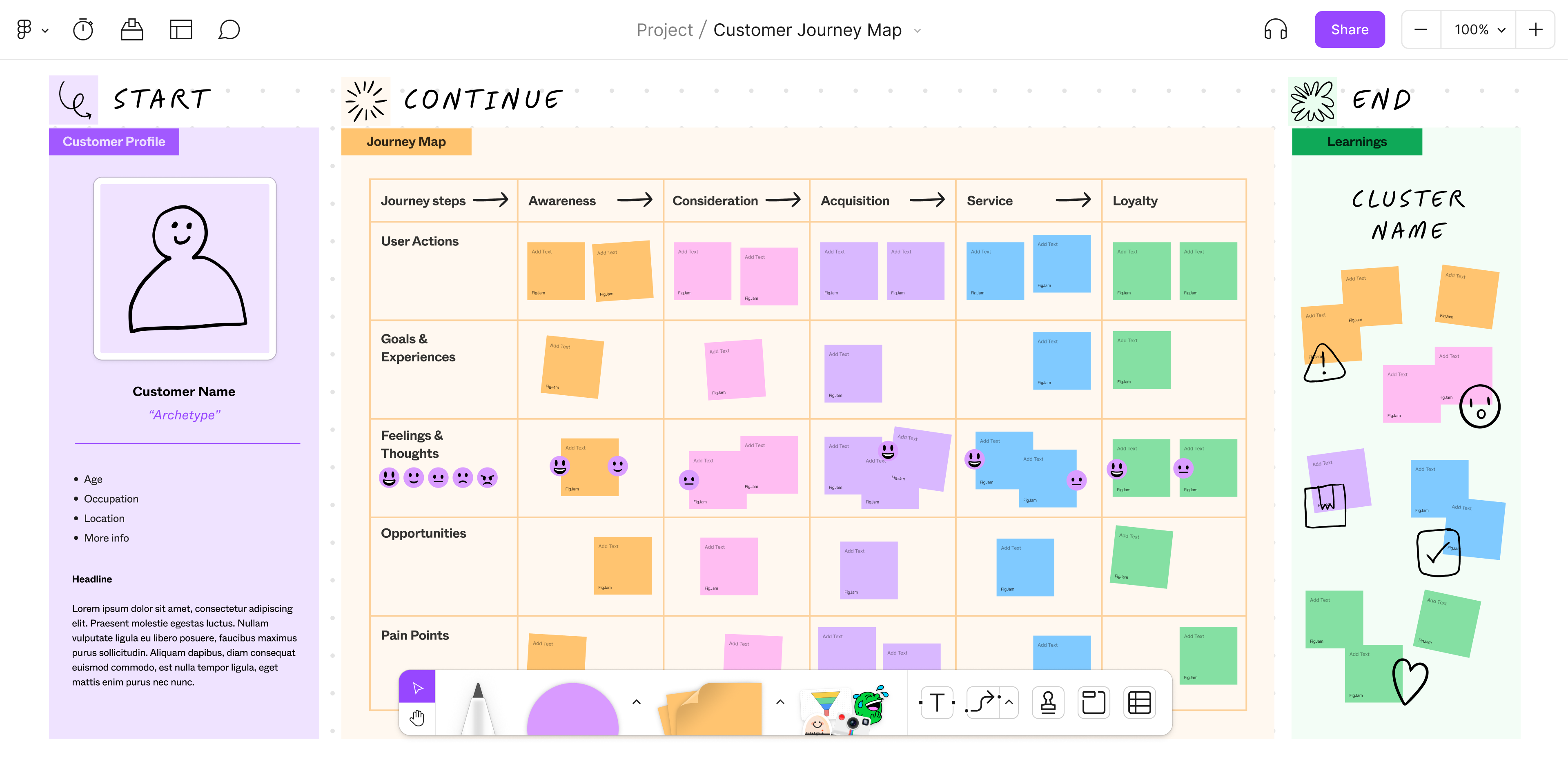
User journey mapping and usability testing
To create a better user experience, your UX team needs to rely on user journey maps. They are visual representations of your customer’s experience that can help you identify pain points, uncover blind spots, and understand where to optimize.

It’s important that your journey map includes personas, scenarios, stages of the journey, user actions, user emotions and thoughts, opportunities, and internal ownership.
The key to creating a useful journey map is to be very specific about user goals, touchpoints, channels, and journey stages. Each of these will help you better understand the different issues your visitors may face, so you can take action and fix them.
Improving site speed and performance
Two components that have a direct impact on your users’ experience are how quickly your page fully loads and how well it performs throughout the visitor’s experience.
You need to take the necessary steps to ensure that it loads in 2 seconds or less. Optimizing images, using https, reducing redirects, reducing server response time, and enabling browser caching are some of the most basic actions you should consider.
Conversion rate optimization (CRO) strategies
There are several strategies you can use to increase your chances of converting every user who lands on your site.
These conversion optimization strategies include some of the things we covered in this article, such as mobile optimization and knowing your target audience. And others that go deeper, such as creating CTAs based on the user’s needs, reducing on-page distractions, using heatmaps, and displaying social proof.
As you can see, user experience is a must. You need to invest in a good team that can help you improve it based on the needs, pain points, and interests of your target users.
Web Design Tools and Technologies
Fortunately, there are several tools you can rely on to put everything we have mentioned in this blog post into practice. Let’s take a quick look at the different options we suggest you take advantage of.
Popular web design tools
The design of your website is important. In fact, today we can assume that it is the main transmitter of credibility. To the point that a poor design and user experience will cause 89% of your visitors to turn to your competitors.
With that in mind, here are the top 4 web design tools we recommend. Some of them will help you build your site without any coding experience. Others will include a code editor. And there are those that will even help you create prototypes.
Wix
An amazing and affordable option designed to help you create websites even if you are just a beginner. It comes with over 500 templates, a drag-and-drop editor, options to increase speed and performance. It’s packed with tools and features that make it easy to add images, videos, animations, buttons and more. And it comes with performance tracking analytics and integrations with Google.
Adobe XD
A vector-based prototyping tool that makes it easy to visualize your designs and user experiences. It allows you to add animations and create responsive designs. Duplicate grids and galleries on different web pages. Import files from other Adobe applications. Best of all, it’s easy to collaborate with team members to streamline the design process.
Figma
A powerful tool with everything you need to create web designs, wireframes, and prototypes. It’s a real-time collaborative tool with access to a large database of plug-ins that enhance its functionality. Figma comes with an amazing template library, auto layout features and more.
Sketch
This web design tool is designed specifically for Mac users. Among its features, it’s a vector-based tool, has prototyping capabilities, and a robust plug-in database.
Content management systems (CMS)
A CMS will come in handy. It is designed to help you manage the content of your site and can make the design process easier.
Some of the best options out there include Wix, the aforementioned design tool, and options such as
WordPress
One of the most recognizable names in the web industry, packed with features that include web hosting, CMS, and tools to build your site. It is a very intuitive software that does not require any coding experience. And it comes with a theme gallery, SEO tools, analytics, marketing, and more.
Joomla
Definitely one of the best CMS platforms out there because of its power and ease of use. However, you need to keep in mind that you will need programming experience to enjoy the many benefits that come with it. It comes with access and management features, a visual editor, and hundreds of extensions to customize the functionality of your site.
Drupal
This option is only ideal if you want to build a complex site with custom functionality. Although it is an open source CMS, there are features that come at a cost. It’s one of the most secure and robust platforms out there, with over 3,000 templates, 40,000 plugins, and it’s completely customizable to your needs.
Front-end development frameworks
To ensure that your site provides the best user experience possible, you need to work with a front-end framework. These are sets of tools that allow you to use elements to develop the front end of your website or application. In other words, it simplifies the process of designing and building the interface.
While there are many options on the market, we encourage you to try one of the following three:
React
Definitely one of the easiest frameworks to learn, it comes with a Document Object Model (DOM) that provides consistent and seamless performance. It allows component reusability, collaboration, and component writing.
Foundation
Designed for enterprise-level development of responsive and agile websites. While its use is advanced and challenging, it is important to highlight that this is a robust option that allows smooth animations, mobile rendering, data exchange, and more.
Bootstrap
A free, open source framework designed to help you build a responsive, mobile-first website. Comes with HTML, CSS, and JavaScript for typography, forms, buttons, and more.
Collaboration and version control tools for web design teams
Finally, we encourage you to use a collaboration tool. This will allow your web design team to stay up to date on enhancements, edits, progress, and more. It makes it easier for your team to stay in constant communication and work towards the same goals, even if they are not working from the same location.
Some of the options you might want to try include
Stormboard: An option that allows you to manage projects, host meetings, and brainstorm ideas. It includes a whiteboard where anyone can add ideas, pictures, text, and more.
20i: Ideal for projects related to web launches, as you can streamline collaboration and manage projects from the same dashboard.
GitHub:Known for its version control features and the way it allows every member to edit, write, review, and comment.
Trends and Innovations in Web Design
As you take on the challenge of building your business website, you need to carefully consider the design trends in the industry. They are aligned with user expectations and interests, and allow you to launch a better product.
For this year you are looking at:
- Minimalist and flat design trends.
- Microinteraction and animation in web design.
- Voice User Interface (VUI) and conversational UI design.
- Augmented reality (AR) and virtual reality (VR) integration.
- Immersive user experience.
- Monochromatic websites.
- High quality product imagery.
- Intuitive navigation.
- Non-traditional scrolling effects.
- Interactive storytelling and audio integration.
So how are you going to use this information to your advantage?
Search Engine Optimization (SEO) and Web Design
It’s well known that all of your digital marketing efforts should revolve around your website. Ergo, you need a site that provides a powerful user experience and converts visitors into customers.
Beyond the grids, typography, colors, buttons, and images, a key aspect is the content you host there. But most people tend to forget about content and SEO when building their site. A terrible mistake.
Your SEO efforts play a key role in the design and development of your site. For example, your domain should be fully optimized as this is the entry point for users.
Indexing, link structure, information architecture, URLs, and navigation are all part of your SEO efforts that should be considered when planning how your site will look and function.
At the same time, there are some best practices that you should always follow.
SEO-friendly web design practices
At Sortlist, we recommend that your web designers and SEO specialists work together to ensure that the following actions take place on your site
Make sure you are working with clean code.
- Avoid using annoying pop-ups.
- Implement https to instill trust.
- Optimize your page speed to improve the user experience.
- Make sure your design is responsive and automatically adjusts to all screen sizes.
- Optimize your content to improve its ranking in search results pages.
- Implement local SEO to increase qualified traffic, lead generation, and conversions.
- Update your site with fresh, value-driven content.
- Optimize your meta tags to give search engines insight into your site.
Ready to get started? Launching a new website isn’t easy, but it’s worth it. Especially when you start to see an increase in your sales and conversions.
Web Design Maintenance and Updates
Don’t think for a minute that all the work is done when you launch your site. On the contrary, your team must now continue to maintain and update your site to ensure that it continues to run smoothly and provide the best user experience possible.
On a regular basis, you need to perform some website maintenance tasks that include
- Performing backups to protect data, files, and content.
- Fixing broken links.
- Performing regular updates to improve features and functionality.
- Deleting spam comments and moderating the rest.
- Scan for malware.
- Test and optimize site speed to ensure it’s always under 2 seconds.
- Improve your SEO.
- Update passwords and manage access.
- Delete unnecessary plugins.
- Test every form on your site.
- Review and update your social media links.
- Check your domain and hosting contracts.
Keep in mind that some of these tasks need to be done as often as every week. Others are annual efforts. And they need to be accompanied by regular site audits that help you identify potential problems and areas for improvement.
Conclusion
While building a website may seem like a lot of work, thinking about the impact it will have on your business serves as a motivator to keep you going and paying attention to every detail.
Make sure you work with a team of professional web designers with proven experience and understanding of concepts like UX, UI, prototyping, and more.
This will ease the process and help you achieve a site that serves your end users and your business goals.
Ready to get started?


