


Editorial Design – 5 Case Studies To Get You Inspired

Last update: 14 January 2026 at 12:04 am

 4.50/5
Anyone who publishes content for print publications such as magazines, books, or brochures should be no stranger to the term editorial design.
But there are many marketers who are not familiar with the specifics and details of editorial design.
That’s why in this article we’ll take a closer look at what editorial design actually is, what needs to be considered when designing content, and what the rules are for designers before we conclude with a look at 5 of our current favorite designs.
What is Editorial Design?
The term editorial design comes from English and refers to the graphic design of print products.
The aim of editorial design is to create the best possible design for the print medium and to provide a suitable graphic background for a written text.
In order to achieve this, the designer deals with all graphic design options, from the font, to the color scheme and layout, to the selection of images, in order to present the content in the most visually appealing way possible.
Editorial design is used in many different media. These include, above all:
- Magazines
- Newspapers
- Magazines
- Books
- Brochures
- Flyers
- etc.
What Do I Need to Consider Before Creating an Editorial Design?
The goal of editorial design is to graphically underscore a text and create an overall image from it. But before we dive into the details of design, there are a few basic points that should always be at the forefront, regardless of the medium.
The Content
To find the best design for a text, you need to know the content and what it’s saying.
This can quickly become very time-consuming for a book with several hundred pages, but this is exactly why it is important to work with the editors or proofreaders.
They know the content of the book and can provide the designer with a summary of the most important points.
The Target Group
In addition to the content topics, editorial designers must also have the readers of the content in mind before they start designing the medium.
During the design phase, they need to have in mind who will ultimately hold the magazine in their hands.
A design will be different for younger readers than for older ones. The same applies to a gender-specific approach.
One of the tasks of the designer is therefore to know the readers in advance and to understand for whom one is designing and they can do so by carrying out target audience analysis.
Corporate Design
Finally, an editorial design must also fit into the overall image of a company. There is no point in having a beautifully designed medium that has no connection to the brand behind it.
That’s why designers should always pay attention to the company’s style guide and let the existing corporate design inspire their new layout.
What Are the Rules for Editorial Designers?
Editorial designers are usually either trained media designers or have completed a degree in the field of communication.
Accordingly, it is not only a matter of having a good eye but also of being familiar with a few basic rules in the field of design.
Typography
Typography is about choosing one or more fonts to emphasize the content and overall visual image of a medium.
The content should always be in the foreground when choosing a suitable font. This dictates which font is used and which design options are employed.
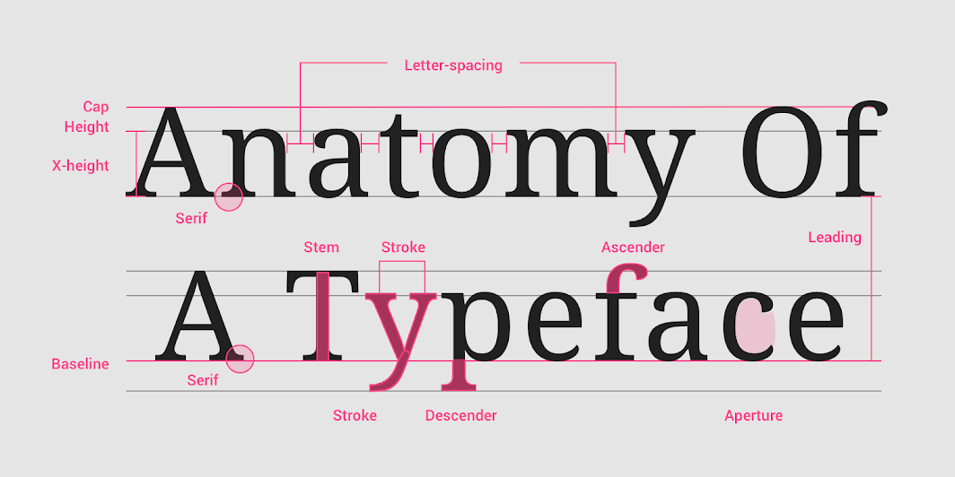
A flyer for a restaurant will therefore have a different font than the layout of a fashion magazine. Nevertheless, good legibility should be ensured in both cases.
For this reason, often no more than one or at most two different fonts are used: one main font and another that is only used selectively to emphasize important content.
Colors
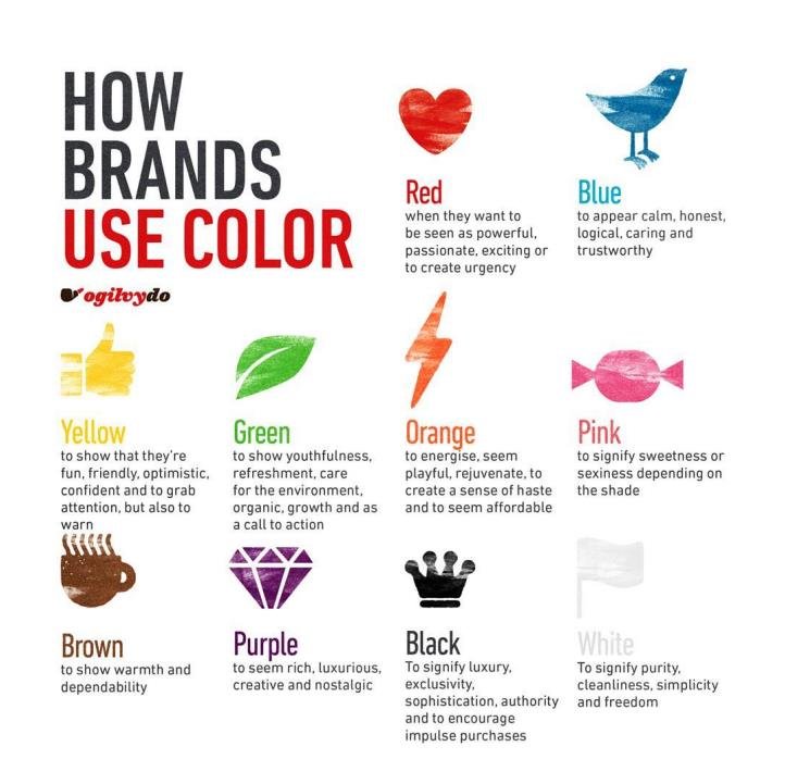
Designers must also be familiar with colors. Knowing about complementary colors and their effects can make all the difference in the design.
Depending on the message of a text or the goal of the design in general, different colors should be chosen accordingly. After all, colors have an impact on our emotions:
Structure
Layout, or grids, refer to the division of a text into different columns on a page. Designing a custom grid can not only improve the flow for readers but also create a unique selling point for the medium.
In addition, there is a choice between a single or a double-page spread, which can influence the selection and placement of images in particular.
Images
As the saying goes. A picture is worth a thousand words. The images for an editorial design should be selected exactly according to this principle.
The image should not only work on its own but also fit into the rest of the design.
Therefore, an image should always be considered in conjunction with the other design options. A black and white photograph can be beautiful on its own, but in combination with certain fonts or subtle colors, it can quickly look stale or out of place.
Also, care should be taken to avoid word-image shear. This refers to layouts that use images in a way that is misleading or incongruous with the written text.
5 Editorial Designs That Inspire Us!
Louisville Magazine – No Justice, No Peace
Louisville Magazine is a US magazine that has been published once a year since the 1950s.
In 2020, a drawing by Breonna Taylor graced the cover of the magazine, paired with an emotionally charged photo story around the protests in the US as part of the Black Lives Matter movement.
We are particularly excited by the interplay of images and type, which, in combination with black, white, and subtle yellow contrasts, clearly foreground the magazine’s message.
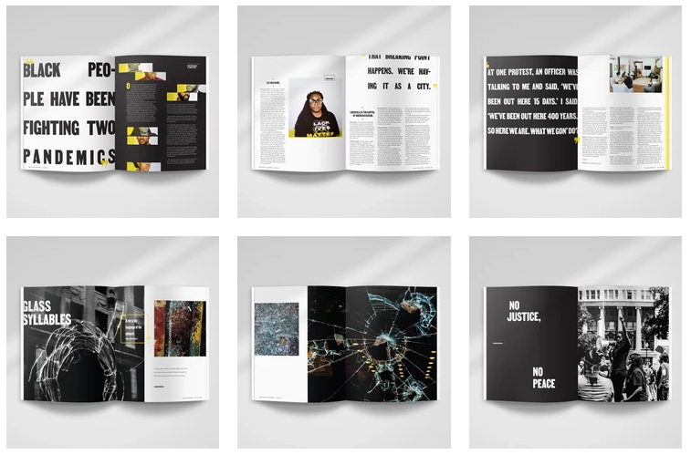
The magazine won the Editor’s Choice category of the 2020 Print Awards for its design.
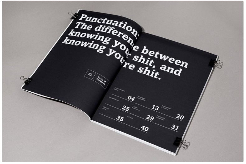
Sidney Lim – Full Stop
US designer Sidney Lim is the designer of the special publication “Full Stop”. The magazine focuses on the importance of punctuation for written language – and has emphasized this message with the design of its content.
Two-page headlines and easy-to-read typeface are made even more concise for readers by the minimalist color palette.
Washington Post – How Many is Too Many
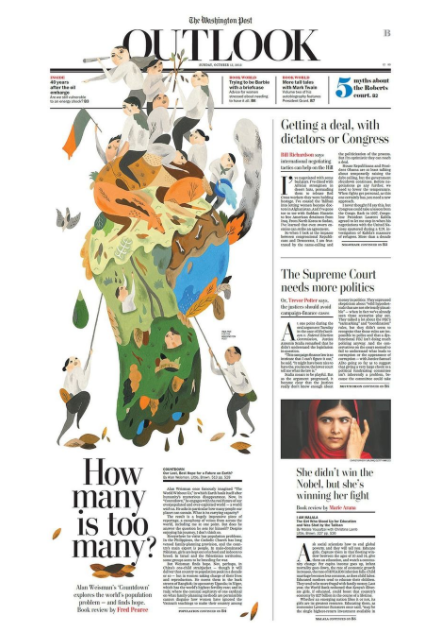
As one of the longest-established newspapers in the United States, the Washington Post has to master several tasks at once: it has to communicate content to its readers while at the same time questioning old design patterns and appealing to a new generation of readers with exciting layouts.
The designer Inca Pan has achieved this in a new way with his layout for the opinion page of the newspaper.
The traditional structure of newspapers is broken up and reinvented with illustrations that goes beyond the actual grid.
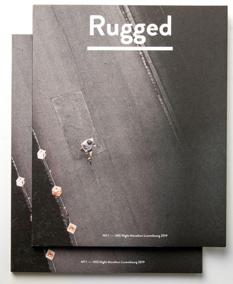
Rugged – Magazine Cover
There are many magazines that want to score points with impressive photographs on their covers.
But it was the courage to choose authenticity over superficial beauty that also convinced the jury of the German Design Awards of the editorial design of the running magazine Rugged.
With the focus on large-scale photography and subtle typography, the feeling of the runner comes across authentically to the reader.
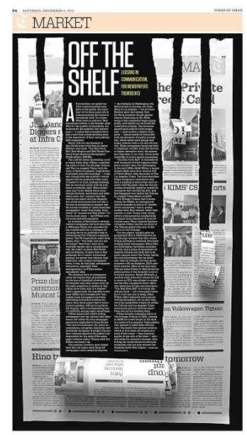
Times of Oman – Off the Shelf
With the attention-grabbing design of this article, the Times of Oman newspaper further emphasizes the content message.
Using an optical illusion, it appears as if the layout of the printed medium has been torn apart. Although the structure of the text is kept relatively small in two columns, it still clearly catches the eye thanks to the well-thought-out editorial design.
The Benefits of Editorial Design
What the presented examples show: Editorial design is important to get the attention of readers and to stand out from the crowd. It pays to be bold. A particularly exciting or unusual design arouses interest and stays in the mind. That’s why it pays to put the design of print media in the hands of professionals and hire a design agency.


