

Neurodesign: The Science of Creating Addictive Websites in 2025

94% of a user’s impression of a website is created by its design. Another key point, is that first impression is made in 50 milliseconds. You have that little time to convince them to stay and guide them on what to do next. Fortunately, today we have a revolutionary approach to web design: Neurodesign.
It combines the principles ofneuroscience with cognitive psychology to create a seamless user experience that guides them to a desired action: buy, fill out a form, subscribe, register, share, etc.
Read on to understand what this approach to web design is all about and how you can apply it to your next project.
Understanding Neuroscience
Neuroscience is the study of the development, structure, and function of the nervous system.
Although it encompasses the entire nervous system, it focuses primarily on the study of the brain, its cognitive functions, and the impact it has on the way a person behaves.
Understanding Cognitive Psychology
Cognitive psychology is the study of human thought processes through behavioral experiments. It analyzes how we think, feel, understand, learn, make decisions, reason, and remember things.
By understanding these thought processes, we can better explain and understand how people react and behave in certain situations.
Neurodesign: How Neuroscience Is Used in Web Design
Neurodesign is the application of these two concepts (neuroscience and cognitive psychology) to web design. It is an emerging field of design that focuses on how a user will react (or what their emotional response will be) to a website with the whole purpose of creating visually appealing sites and enabling a better user experience.
What Are The Principles of Neurodesign?
Because neurodesign focuses primarily on how users perceive and process visual information, authors and experts agree that there are several neurodesign principles that can be used to guide your site’s users toward the desired action.
Let’s take a closer look at what they are and how they affect your finished product.
Visual Hierarchy
The brain is wired to process information by prioritizing elements and information based on size, contrast, and location.
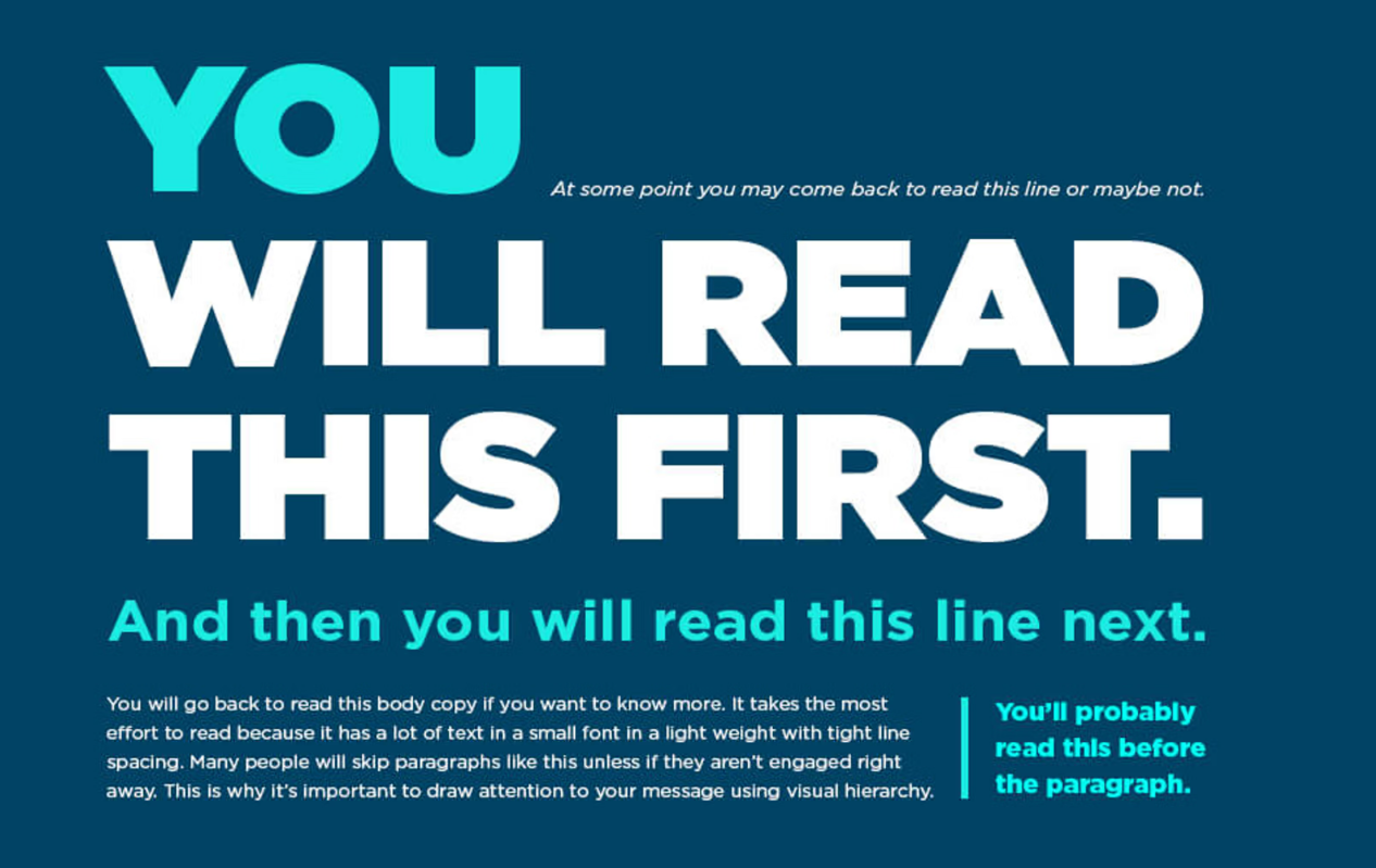
Understanding this will help you structure your site so that the most important design elements are always first and lead to faster decision making.
To apply this principle, you must
- 📐Make important elements larger than your supporting details.
- 🔲Use high contrast to highlight key elements and create visual separation.
- 🔠Work with different font sizes, weights, and typographies to indicate hierarchy in text.
- ⚪Use negative space (white space) to give your most important elements room to breathe.
- ➡️Create a visual guide for the user’s eye by arranging elements consistently.
- Place important CTAs in high-visibility areas.
Color Psychology
Certainly, color psychology has been widely studied and shows that colors can greatly affect a person’s mood. Each color is associated with specific psychological responses.
- 🔵Blue: Trust, peace, loyalty.
- 🟡Yellow: Creativity, Happiness, Warmth.
- 🔴Red: Excitement, strength, love.
- 🟢Green: Nature, healing, freshness.
- ⚫Black: Formality, drama, sophistication.
- 🟠Orange: Confidence, success, courage.
You can apply this neurodesign principle you should:
- 🔲Use color contrast to make your content easier to read.
- ➡️Create a color hierarchy to direct users’ attention to different areas of your site.
- 🎨Choose an emotional color palette that matches the emotional response you want to evoke in your target audience.
F-Pattern and Z-Pattern
To create a site with great user engagement, you must first understand how the average person behaves on the site.
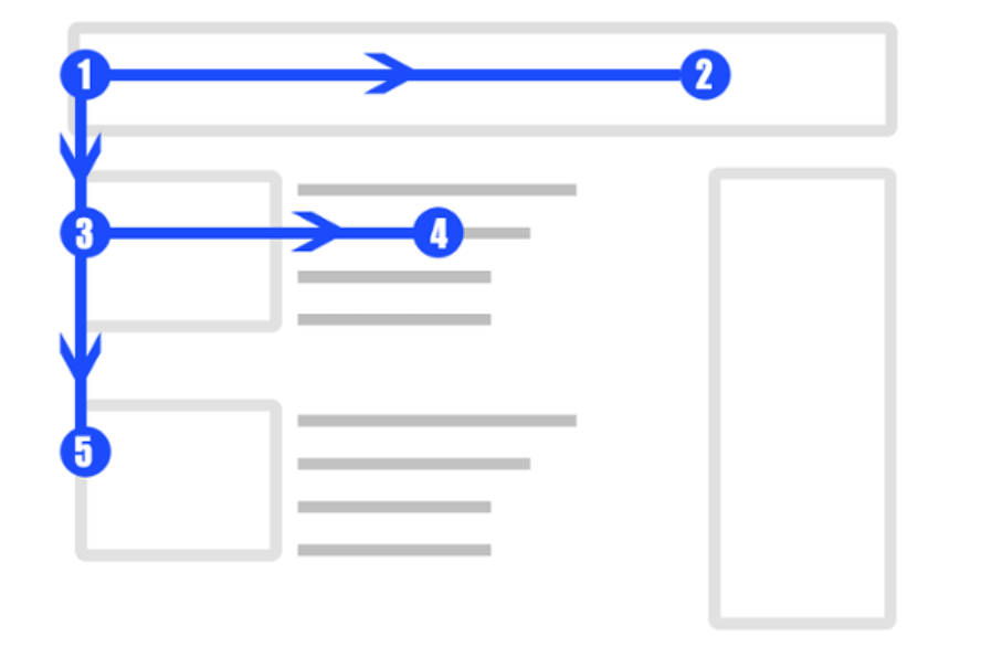
Different studies show that users don’t actually read all of the content that is shared. They tend to scan it, and depending on the length of your site, it’s either one of these two options:
- F-Pattern: They start at the top left of your page, move horizontally, and then scan it down in the shape of an F.
- Z pattern: They start at the top left, move horizontally, and then scan downward in the shape of a Z.
In general, the F pattern is most common on longer pages, and the Z pattern is usually what happens when a user lands on a page with minimal text.
Knowing this allows you to place key design elements in the most visible areas.
White Space
Evidently, white space in web design is there for a reason: it helps improve readability, reduces cognitive load, and most importantly, it helps people focus.
In other words, adding the right amount of negative space helps users feel more comfortable reading and engaging with your content.
Some best practices for incorporating this psychological principle include
- ⚪Use micro-white space around smaller elements of your web design.
- 📐Include larger white spaces between sections of a page or between images.
- 📌Surround your CTAs with white space.
- 📱Optimize your white space for mobile devices.
Social Proof
Users trust other people’s opinions and comments about your brand more than your ads and posts – you need to accept this and act on it.

- 🗨️Include customer testimonials and reviews about your products.
- 📌Place your social proof sections near your call to action.
- 👤Work with images of your actual customers, avoid using stock photos.
- 📛Include security certificates, statistics, or any other form of trust.
Conclusion
Implementing neurodesign on your current website will make a difference. Contact our web design agencies and start seeing amazing results soon.


