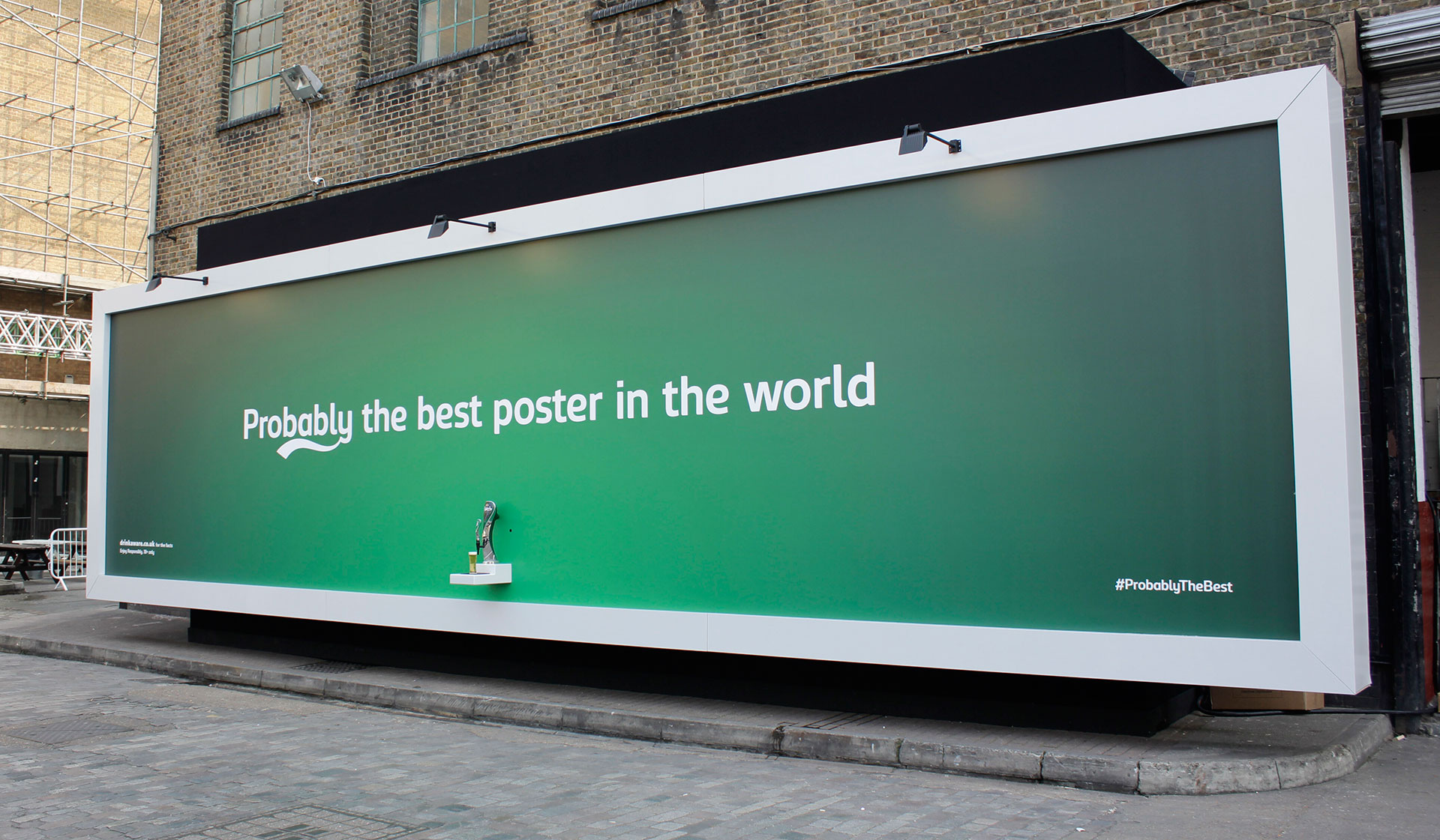
How to Create An Effective Billboard Design? 7 Tips For Designing
Last update: 7 November 2023 at 02:09 pm
Are you looking to create an effective billboard design?
You’re not alone—billboard advertising is one of the most popular forms of advertising, and it’s been around since the 1960s. But while many people know that billboards are good for advertising, they don’t know how to create them.
Billboards are everywhere. They’re on the side of your local gas station, at the bottom of your TV screen, and in front of your favorite restaurant. They’re even sometimes in your social media feed! These ads are a great way to advertise your business, product, or event, but designing one can be daunting.
Here are seven tips that will help you create an effective billboard design:
1. Determine The Type Of Billboard You Want
A billboard is a large advertisement that can be seen from long distances. They’re usually placed on the side of roads, walls, or buildings. The purpose of these ads is to attract customers and make them aware of a product or service.
There are different types of billboards that you can create depending on the kind of message you want to send out to your target audience, and here are a few of them:
Directional
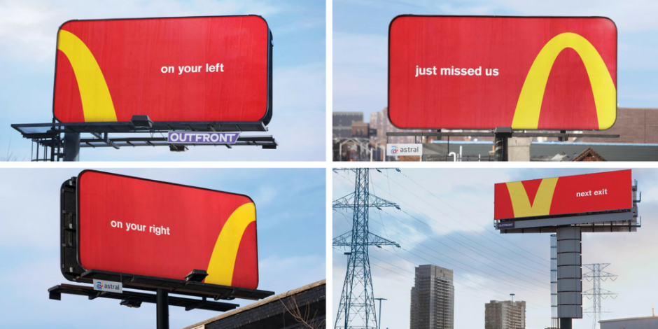
A directional billboard displays visual content facing in a particular direction. Advertisers and marketers prefer this because it allows them to target specific audiences. Directional billboards are usually placed at busy intersections or highways, so drivers can easily see them as they drive by.
The directional type comes in two forms: static and electronic. Static directionals are made using large vinyl signs, which can be changed manually or automatically using a changing sign system.
Electronic directionals are digital signs that use LED lighting to display messages or images in a specific direction.
Traditional
A traditional billboard is a large outdoor advertising structure, typically found in high-traffic areas, such as alongside busy roads. They come in many sizes and shapes, from large static ads that can be seen on the freeway to smaller, moveable signs that are used for small businesses.
The biggest advantage of the traditional type is its size. Because such billboards use so much real estate, they can be placed in areas with high traffic volume and will attract attention from both drivers and pedestrians alike. Traditional billboards also tend to cost less than other types of advertising because they don’t require additional equipment like digital displays do.
Digital
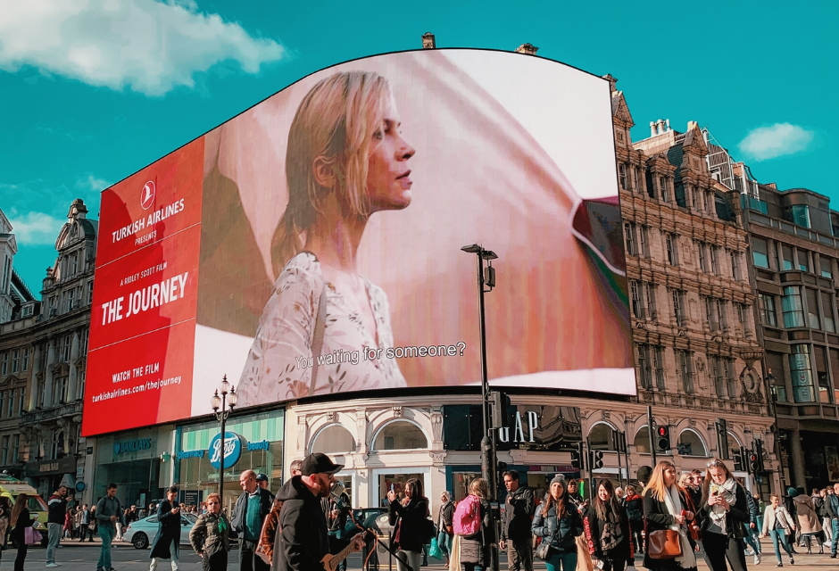
A digital billboard ad is a large screen that displays advertisements to passing motorists. They can be used to deliver a variety of different messages and images, including video, animation, and audio. They’re typically located along busy roads and highways, where they can reach a high volume of drivers or pedestrians at once.
Digital billboard advertising has been around for decades, but its use has increased significantly since the early 2000s. As technology has improved, so have the features of digital ads. Today’s digital billboard ad is brighter, more colorful, and offers more interactivity than ever before. They can even track drivers’ eye movements to ensure that potential consumers see ads as they travel past them on the road!
Mobile Billboards
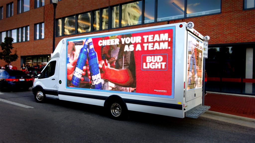
Mobile billboards are a great way to reach your target audience and increase brand awareness. This type is a vehicle that advertises your business or products and services by driving down the road, parking in high-traffic areas, and displaying your message.
A mobile billboard allows you to get creative with your advertising message. It can have one or multiple sides, each with its own image or design. You can choose from full-color printing, vinyl wrapping, or a custom wrap!
They’re also known as roving billboards, mobile signs, or truck ads. When they’re parked in high-traffic areas like grocery stores, and gas stations, they are referred to as “parked” ads.
Painted Billboards
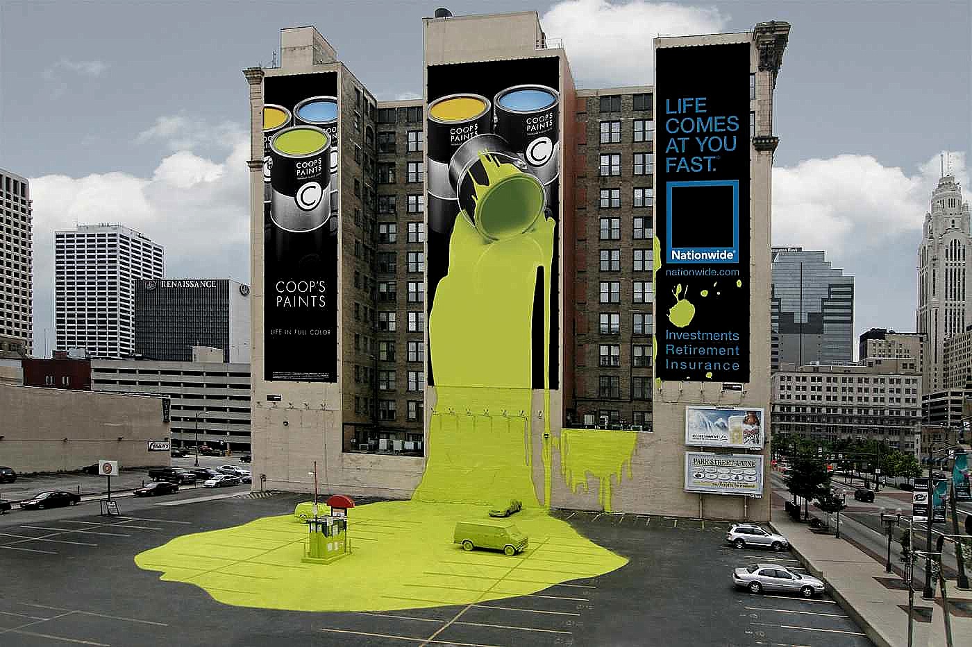
A painted billboard is one that has been painted over and looks like artwork. They’re usually used in areas or a community where the land is too expensive or difficult to clear and build on or where zoning regulations prohibit the traditional type. Small businesses typically rent these billboards to advertise their products and services.
The painted billboard industry has been around for decades and continues to grow as more businesses recognize its benefits. The main advantage of this type of advertising is that it can be placed almost anywhere there is an appropriate surface to paint on. This makes it possible for small businesses to reach customers in high-traffic areas at a fraction of the cost of traditional advertising methods like radio and television spots or newspaper ads.
Painted billboards are also known as outdoor boards, wallboards, and street signs. They’re commonly found along busy highways, local roads, and city streets where thousands of people can see them daily.
3D Billboards
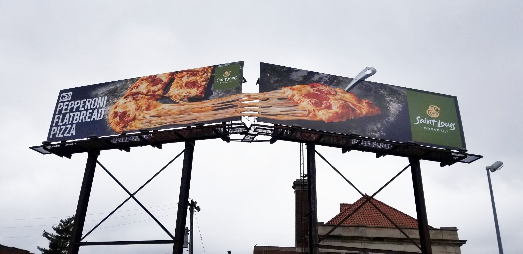
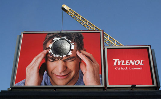
3D billboards are a recent development, but they have quickly become popular advertising. It’s not hard to see why. 3D ads can be seen from different angles, creating a unique viewing experience for those who view them.
They’re typically created using 3D printing technology or the same kind of technology used to create a hologram. In both cases, the image is projected onto the billboard from behind it. This means that when you look at the billboard from one angle, you’ll see one thing; when you look at it from another angle, you’ll see something completely different.
The first 3D billboards were actually made using lenticular printing technology, which uses a series of lenses to create an illusion of depth in images printed on paper or plastic.
This is how many old-fashioned flipbooks worked — they were printed with lenticular ink so that when you flipped through them quickly, it looked like motion was happening in the book. The same principle applies to 3D billboards that use lenticular printing — as people walk past them or drive by them on their way home or work, they get a different view every time they look at it.
Think About Your Audience
One of the crucial steps in creating an effective billboard design is to consider your target audience and what you want them to do after seeing the billboard.
One of the best examples is if you’re selling products or services, you need to inspire people to visit your website or call your business directly. If you’re selling a product, you need to get someone excited enough about it to come into the store and purchase it immediately.
Many companies make the mistake of thinking that all they need is a catchy headline and some text on their billboard design, but there’s more to it than that! You need something that’ll grab attention and inspire people to take action immediately – either by visiting your website or calling your business directly!
Looking |
Discover the most relevant agencies for your project based on your own specific requirements.
Find an agency!Make It Simple and Clear
Great billboard designs are simple and clear. They can be used to promote a product or service and create awareness in people’s minds. It’s also a good option to use billboards as a medium to increase sales.
Here are some tips for creating effective billboard designs:
Write A Catchy Caption
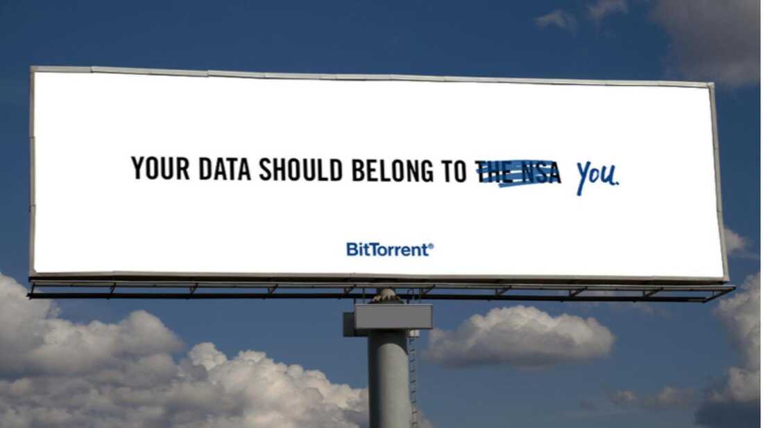
The caption on your billboard is the most important part of your design, so it’s worth putting some thought into it. Make sure it’s short and to the point, with no more than three words. It should also be something that will catch people’s attention, so try to include a call to action in there as well.
Use Simple Colors
Make sure you choose an appropriate background color so that the text on your design doesn’t blend into the background too much and becomes illegible when viewed from afar.
Basic colors like black, white, and red are best for billboards because they tend not to get lost in the background. This gives you more room to create an eye-catching design without worrying about placing your text in the right place at all times. You can also use these colors in combination with other colors, such as yellow, blue, or green, for a bit more variety.
Use White Space
White space can make a huge difference in the effectiveness of your design. It allows the viewer’s eye to rest, creating an illusion of depth and space for your design elements.
Keep The Design Simple And Easy To Read
Avoid using small type or too much text, which can be difficult for drivers to read while driving past at 55 miles per hour (89 kilometers per hour). Use large letters or symbols instead of small ones.
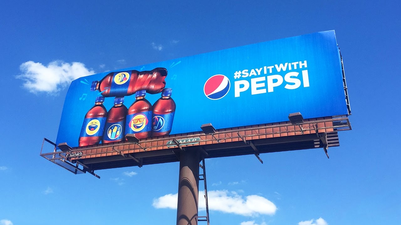
Have Compelling Images
One of the essential elements of a billboard design is the image. Images that are too small or lack impact can make your message difficult to read. Luckily, you can redefine art creation with Picsart’s AI, which uses cutting-edge technology to create high-quality, impactful visuals perfect for your billboards.
It’s important to know what type of image is best for your signage, and how the image should be sized to fit the space available.
The purpose of images on billboards is to attract attention to your business or product. To do this, you need to convey a clear message and make it easy for people driving by to understand what you’re offering. One way to make sure that your message comes across clearly is by using high-quality, compelling images.
Images with sharp, crisp lines are always preferable over those with blurred edges or other imperfections. The more detailed an image is, the easier it will be for viewers to read from a distance.
Here are some tips for creating compelling images for your next billboard design:
- Use bright colors that stand out from their surroundings.
- Choose images with little or no text unless absolutely necessary.
- Use images with strong emotions or feelings associated with them.
The size of an image on a billboard depends on several factors, including the sign itself and whether there’s room for additional text alongside it or below it in smaller font sizes (usually limited). The larger the sign, the larger its images can be as well — so if you have several large signs in one location, you may want larger images on each one rather than having them all be similar sizes.
Use Your Company Logo And Tagline
A billboard is an excellent place to establish your brand identity and build brand recognition among potential customers. You want people who see your billboard to know immediately what it’s promoting and associate it with your company.
Logos should be a part of the design. It’s one of the most important elements of your brand identity, so it should always be included in your advertising materials.
Your logo should also be recognizable and consistent across all platforms. This means that if you have a website, social media pages, email signatures, and other marketing collateral, then they should all use the same design elements as your billboard.
This can be done by prominently using your logo and tagline on the board itself or on top of it. For example, if you have a logo with colors that match those found in nature, like green or blue, you can use these shades in whatever background color you choose for your board so that they stand out against it.
Use Contrast And Visual Hierarchy
When you’re designing an effective billboard, you need to think about contrast, visual hierarchy, and color. Here’s how to make sure your design works:
Contrast is a key element of design, and it can create visual interest and help direct the viewer’s eye toward what’s important on a page or website. With billboards, contrast is especially important because you want people to notice them at a distance.
Visual hierarchy is another important design principle that can help guide the viewer’s attention. It ensures that the most important elements are seen first and foremost by breaking down a design into smaller sections with different levels of importance.
The combination of contrast and visual hierarchy is crucial for effective billboard design because it helps people see what they need to see at a glance — whether that’s a phone number or an invitation to visit your store.
Contrast and visual hierarchy are crucial elements in any design, especially when it comes to billboards. There are several ways to use these elements in your billboard design. Here are some tips:
- Use contrasting colors: If you have a single color on your billboard, consider using another color that contrasts with it for the text or other graphics. This will help draw the eye to specific parts of the board;
- Use different shapes for text and images: This is similar to contrasting colors but focuses on shape rather than color. For example, if you have a square box for text on your board, place an oval shape within that box for an image or logo so that they don’t compete for attention from viewers. The same goes for creating boxes for text — make circles or other shapes for images so that they stand out from each other better and don’t compete visually with one another.
Add A Call To Action
A call to action is a phrase or word that encourages people to take a particular action. When used in advertising, it can be an extremely effective way to motivate people to respond to your message.
When creating a billboard design, you should always include a call to action so that you can create an effective ad. A call to action lets people know what they should do next and encourages them to take the next step toward making a purchase or taking other desired actions.
A call to action should be placed in the center of the billboard design and should be easy to read. Using color and font style will help make it even more effective.
You can use different types of calls to action on your billboards, depending on what you want people to do:
- Visit Your Store: You could use this type of call to action for retail stores that want customers to visit their physical location. Visitors can see what’s available in the store or find out about special offers available only at that location;
- Book Now: This is suitable for restaurants, hotels, and other places where visitors must book ahead of time to avoid disappointment. For example, suppose you’re promoting an exclusive event at a hotel. In that case, you might want people interested in attending it to book now, so there are no disappointments later on when they arrive at the hotel only to find out it’s fully booked.
Here are three key ingredients to making sure your billboard designs include effective call-to-action phrases:
- Make it clear what you want the reader to do;
- Use words that attract attention and make them want to act on the call to action;
- Use a design that makes it easy for people to take action, like a phone number, email address, or website.
Extra Tip
Where you place your bigboard is as important as its visual aspect. For example, if you want to advertise a crypto bot for traders, it will have little effect if placed at the entrance to a neighborhood supermarket. Meanwhile, a billboard advertising a detergent or new-flavored potato chips would make a great addition to the location.
Conclusion
If you’re ready to create a good billboard design, you must clearly understand what makes it effective. The tips in this article will help you know how to design a successful billboard to reach your target audience and make them want to buy your product or service.
Remember: your goal is to create a billboard that’ll have people stop in their tracks, take out their phones, and snap a photo of the ad. This is the kind of ad that can make or break the success of your business. With this in mind, make sure you design an ad that’ll be eye-catching and memorable for all the right reasons.


